Are you a Quiet Speculation member?
If not, now is a perfect time to join up! Our powerful tools, breaking-news analysis, and exclusive Discord channel will make sure you stay up to date and ahead of the curve.
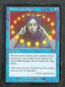
Welcome Back! I hope all of you were successful in your Go for the Throat alters. For today's article I'd like to begin by discussing one of the main financial benefits of this process, and that is “upgrading” cards that are a little beat up. It's no secret that cards in less than near mint or excellent condition are sometimes desirable. Force of Will, Revised dual lands and Tarmogoyf are popular choices for this as it holds their prices down a bit. Of course these cards can be altered to increase their value, and hopefully can be flipped for a tidy profit, but what happens when you have a beat up card that is only $3 or $4 when it is in perfect condition? A card like Swords to Plowshares or Brainstorm that sees a lot of play in many legacy decks can be difficult to move in played condition. This is where your art skills can have a huge effect on your trade binder. By painting these cards you can take a piece of dead weight and turn it into an interesting and important part of your collection, while increasing the cards' value and the efficiency of your binder all in one fell swoop. Without further adieu, let's dive into today's demonstration.
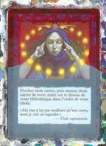
As you can see in figure 1, today's card is the aforementioned Brainstorm. This particular version is French. I picked it up a couple of months ago as part of a larger trade but it hasn't drawn any interest since then so it is a perfect candidate for an upgrade. To start with, lay down your first coat of paint. For the upper half, use Naphthol Crimson and the bottom half should be done in a mid-tone Grey created by mixing Mars Black and Titanium White. The half-way point is determined by where you think the lady's cloak will end up. As you can see in figure 2, the Red does not cover as well as the Grey does. This will not be a problem as its' main function right now is to give a base color and help you visualize what the project will look like when completed.
Moving forward, it is worth noting that it is almost always right to start with the background and move forward when painting. This will help with the illusion of depth and will also allow you a certain amount of leeway when painting near borders. So looking at the background, take note of its' colors. While the overall effect is Red, upon closer examination the pattern is made up of everything from a dark Grey to a bright Orange highlight. To recreate this effect start with the darkest color and move upwards from there in tone. There is also a handy brush technique to help achieve this as well and it is called dry-brushing.
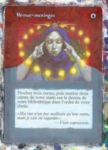
The process of dry brushing is very simple, but it can be used to create very interesting patterns and effects, as well as being an excellent blending technique. Just take your brush, dip it in a small amount of paint, and then brush it on to your canvas until you notice the paint streaks thinning. At this point you then apply quick “wispish” strokes to your project. This will add a small amount of pigment onto your project while still allowing the color underneath to show through. Turning towards your card, try doing this with a very dark Grey mixed from Naphthol Crimson and Mars Black. Remember to use short swishing brush strokes, you are not looking for coverage as there will be a number of coats to come after this. When you've finished the whole background with the grey, gradually add more Red to your mixture and repeat the process. After a while you should get to a point where you are not mixing the black in at all and are using straight Red. At this point it's time for a new mixture of color. Before you do that however, it may be worth your while to clean up the name of the card as well as its casting cost before you lose them under the paint. Find your trusty toothpick and very carefully and gently pick out the name of the card and the casting cost (Fig. 3). Take your time on this, one slip up can cause an alarming amount of time fixing it.
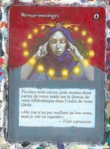
For the next mixture add Cadmium Yellow to Naphthol Crimson until you have a color slightly on the Red side of Orange. Then mix in Sparing amounts of Titanium White to achieve the proper hue. Lightly dry-brush this color onto your background. Remember that due to print runs and ink cartridges, not all cards are the same exact color, so work with your colors until they match your specific card. Repeat this process until you are satisfied with your background. Don't forget to overlap with the original art a bit to help blend the colors (Fig.4).
Now that the background is finished, it's time to turn our sights to the lower, more tricky half of the card. It is here that you must stop and think about composition and design. The woman’s arms do not stop at the frame anymore and neither does her cloak. You must think about how and where their respective forms complete themselves. When you have a basic idea about how this will happen, sketch out how you want these details to look. I've used a pen in figure 5 to help you see where I've made my marks, but usually a pencil will work just fine and will be easier to paint over.
Once you've made your guide it's time to paint it. Remembering to paint the farthest object first, start with the inside of the sleeves using Mars Black. The cloak appears to be blue, but it is actually a mixture of Purples and highlighted with a very light Blue. An equal mixture of Naphthol Crimson and Ultramarine Blue with a touch of Titanium White gives it a lavender hue. Taking your queue from the artist, match this color with the folds of the cloak, using White and Blue to vary the shades as needed. Paint in long thin brush strokes to emulate the folds of the cloak. Fill in with a mid-tone of the Lavender you've created. The 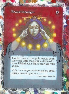 highlights can be created by mixing the Ultramarine Blue with Titanium White. The highlights can be very easy to over-do, so be careful. Take the color of the sleeves down the border as far as you want to. It will eventually be faded into Black at the bottom. The woman's arms are a bit tricky. The color is a lighter version of the purple that we used on the cloak. It is important to note that it is also reflecting the light from the glowing symbols. So add a touch (really, just a touch) of Cadmium Yellow to your mixture for the highlights for the arms.
Next we have the neck. Use the base skin tone from the arms here. The shadows can be created and matched by a subtle blending of the skin tone with Naphthol Crimson and Cadmium Yellow. Don’t forget that the cloak will create a small pencil thin shadow where it meets the skin.
Finally, to finish the bottom of the card fade the design into black. This is done by creating the mixture of paint used on the cloak and gradually adding black to it. Black is a very strong color, so it will take very little to overpower a light purple such as the one you are using. The blending should be done with a slightly damp brush to ease the gradient together on the sides of the text box.
Let your card sit for a little while, drying. Stand up, stretch and get a drink. Make sure you look at something completely unrelated at this point. This will allow you to come back to the card with a fresh eye. After about ten minutes return to your card and decide on any finishing touches you may want to add. Are the highlights on the cloak light enough? Is the color uneven in spots? Look critically at your own work as if you had never seen it before. This last minute scrutiny can take artwork from good to great (Fig.6 if I may say so myself). Once you have finished your review, find your trusty toothpick and clean up the text box.
For a lucky number of you, this will be the end of your project. For the rest of us, you will finally learn that your toothpick is not infallible. Occasionally, on certain cards paint can leave a slight residue even after being scratched off. It
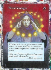
doesn’t happen often, and it is not noticeably apparent, but it is enough to drive an artist nuts. The only thing that can be done is to ignore it. Most people won't notice it.
Congratulations! You've just upgraded your binder without even a single trade partner! It should be a lot easier to find a home for this card now that you've made it beautiful!
Don’t forget to leave some sort of feedback to help me improve these articles. Whether it's by leaving a comment here or contacting me on Twitter (PaintersServant), or even sending me an email (Mbajorek02@gmail.com). If you do decide to email me, try to send pictures of your work and maybe I'll post it here!
Until next time!
-The Painter's Servant




La carte est française, serais-tu un Painter Servant français ?
"Nice Work" en tous cas !
I had never thought of using the skill of altering to "fix" cards that aren't N/M. That has to be one of the strongest arguments for me to learn how to do this.
I really like the walkthrough style of the article, specifically how you're using the same core set of paints that you recommended at the beginning. Color selection and recreation has always been the most daunting part of getting into alters for me.